Kaya: Creating a visual language that is distinctly Filipino and uniquely its own
My collaboration with Kaya started with a conversation with co-founder Jamilyn, back when it was just a dream taking off between her and Chef Lordfer Lalicon.
Kaya was the first of its kind in Orlando: a fine dining spin on Filipino cuisine. Any Filipino with a mom or an aunt knows how controversial this is within the community. You don't put fine dining and Filipino cuisine in the same sentence typically. Filipino restaurants, at least in Florida, usually meant a very specific hole in the wall at very random retail strip you would never go to otherwise.
I recognized their shared vision—to elevate Filipino cuisine while opening it up to a broader audience. All while staying true to the culture. What stood out most in those early conversations, and ultimately inspired the logo is the concept of bayanihan. Symbolized by neighbors physically lifting and moving a traditional stilt house to a new location, bayanihan is a profound Filipino spirit to be in community-a core pillar in Jami and Chef Lord's vision.
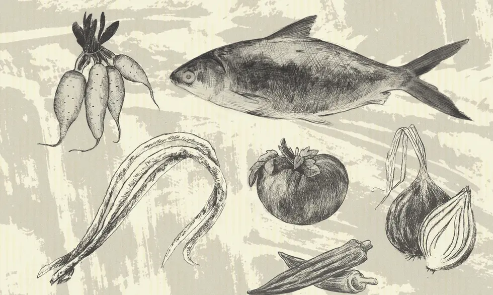
My work with Kaya involved a full brand identity system that extended from logos, colors and type to a brand expression that distinctly reflects Filipino history, values, and contemporary aesthetics.
Kaya has since then been rewarded Florida's first Michelin Green Star for sustainability and was a 2024 James Beard Award Finalist for Best New Restaurant.


